Empowering user-centred content and design
Organisation: Royal National Institute for the Deaf (RNID)
Overview
RNID’s Design Team identified a need to create a Content and Design Framework to help people in different content and design roles from across the organisation create more consistent and accessible experiences for users.
The way elements like language, buttons, and colour were used was inconsistent across different journeys which made it difficult for users to navigate and understand content. The internal approach to content and design was also resource heavy and inefficient, relying on a few roles to be involved across most content and design activity.
I worked as part of an agile team to design a framework to address these problems by providing a set of guidelines and tools to help content creators make sure they are creating consistent, high-quality, and purposeful content across all digital channels.
User need
As a user of RNID’s digital channels I need content to be clear, consistent and accessible so I can find what I’m looking for with ease.
Business need
We need a framework that empowers staff to create consistent, high-quality, and purposeful user-facing content across all digital channels so we can create better content more efficiently.
Team need
As a design team, we want to take an Agile approach to this work so that we can adapt as we learn and demonstrate the value of this way of working to organisation.
Outcome
A live MVP of RNID’s first Content and Design Framework (including an accessibility guide and component library) and a strategic vision for iterative development.
My role: Service Designer
Key collaborators:
Head of Service Design
2x Content Designers
Interaction Designer
Digital Content Manager
Methods:
User interviews
Insight synthesis workshops
Problem prioritisation
Low-fidelity prototyping
User testing
Timeframe: May-August 2024
Approach
Agile ways of working
When we started this work, RNID had ambitions of being an Agile organisation, but in practice most staff had little understanding or experience of what Agile working actually looked like. As a small team with Agile experience from previous roles, we saw this as an opportunity to demonstrate Agile in action, while delivering real impact.
Some of the ways we did this were:
Breaking the work into two-week sprints and setting sprint goals
Working in the open by hosting fortnightly show and tells where stakeholders could feed into the work
Holding regular retrospectives to reflect on and adjust our approach
Understanding the problem
We started this work without a preconceived idea of what RNID’s Content and Design Framework would look like. To find out what it needed to be and do, I led the team to plan and conduct interviews with 15 staff about their experiences, needs, and pain points in relation to content and design at RNID.
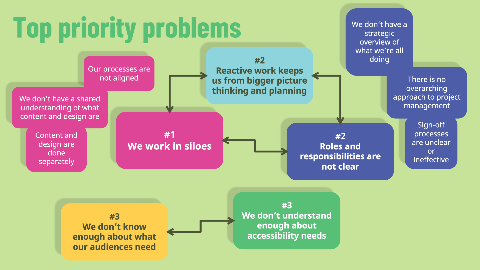
From these interviews, we synthesised over 2100 digital sticky notes into 7 key insights. We then mapped the underlying problems behind each insight.
I then designed and facilitated a workshop with 14 stakeholders to prioritise the most important problems to solve by focusing on the impact that solving them could have. Through this workshop, we identified and mapped 5 top interconnected problems.
Creating a vision for the framework
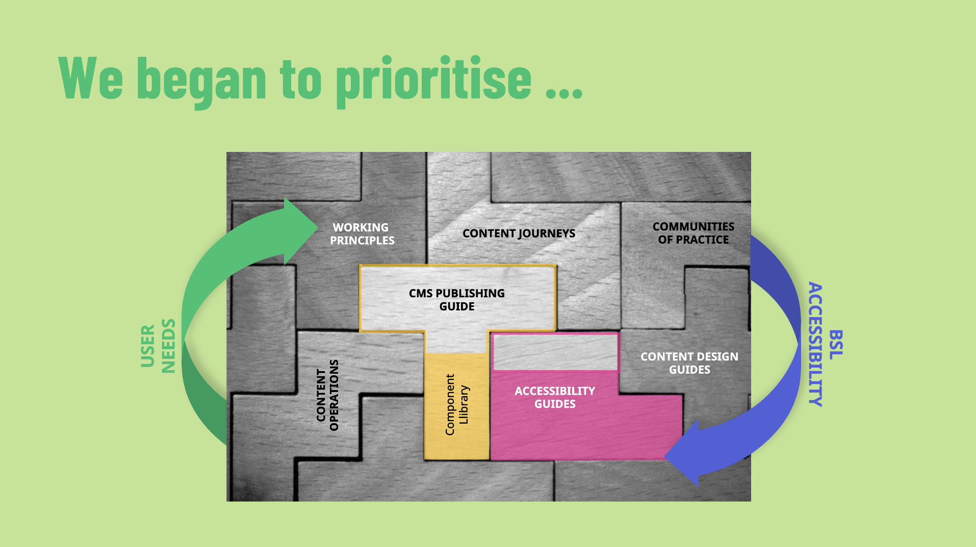
To create a vision for our framework, we started with desk research to find out what has worked for similar organisations. This highlighted 15 possible element that we could include.
To understand what RNID most needed, we mapped each element against the top 5 problems they might help to solve. This highlighted 7 elements that would deliver the most value for RNID.
We then used an effort/impact matrix to evaluate each element. We arrived at two elements that would have the greatest impact on the top priority problems and could feasibly be delivered within the scope of the project:
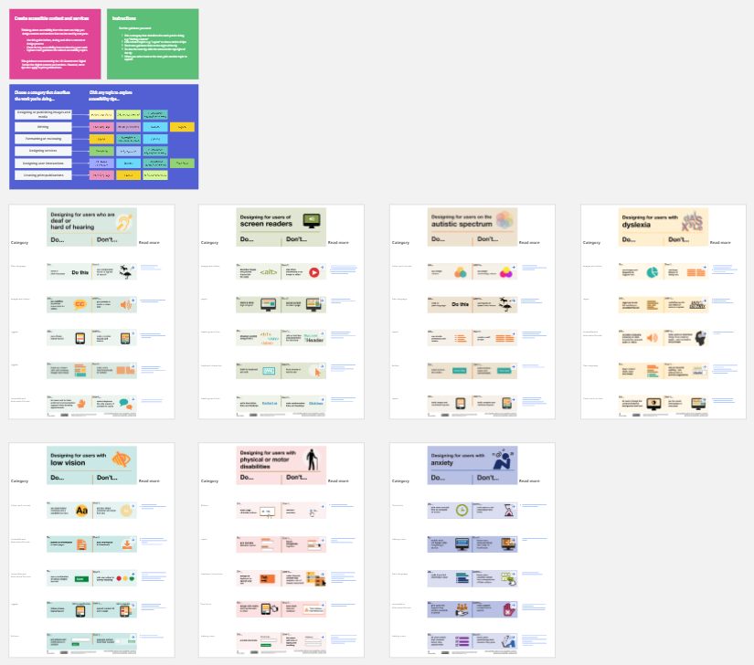
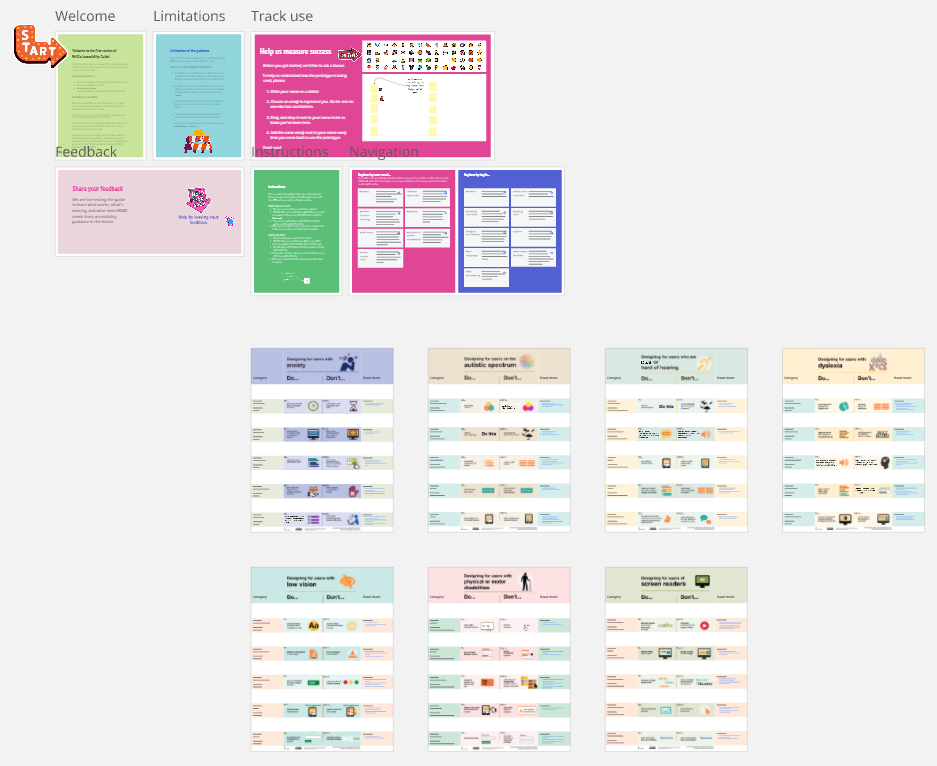
A Component Library as the first part of a CMS Publishing Guide
An initial Accessibility Guide
Low-fidelity prototyping and testing
Bringing together interview findings with user behaviour analytics gathered from the website, we created MVP prototypes of the Component Library and Accessibility Guide.
We created prototypes in Miro (a virtual whiteboarding) because it was a quick, easy, and low-cost way for us to test, learn and iterate towards evidence-based solutions that would work for RNID. I led the team to plan and conduct moderated testing sessions using each prototype to gather insight into on what worked, what didn’t, and what was missing.
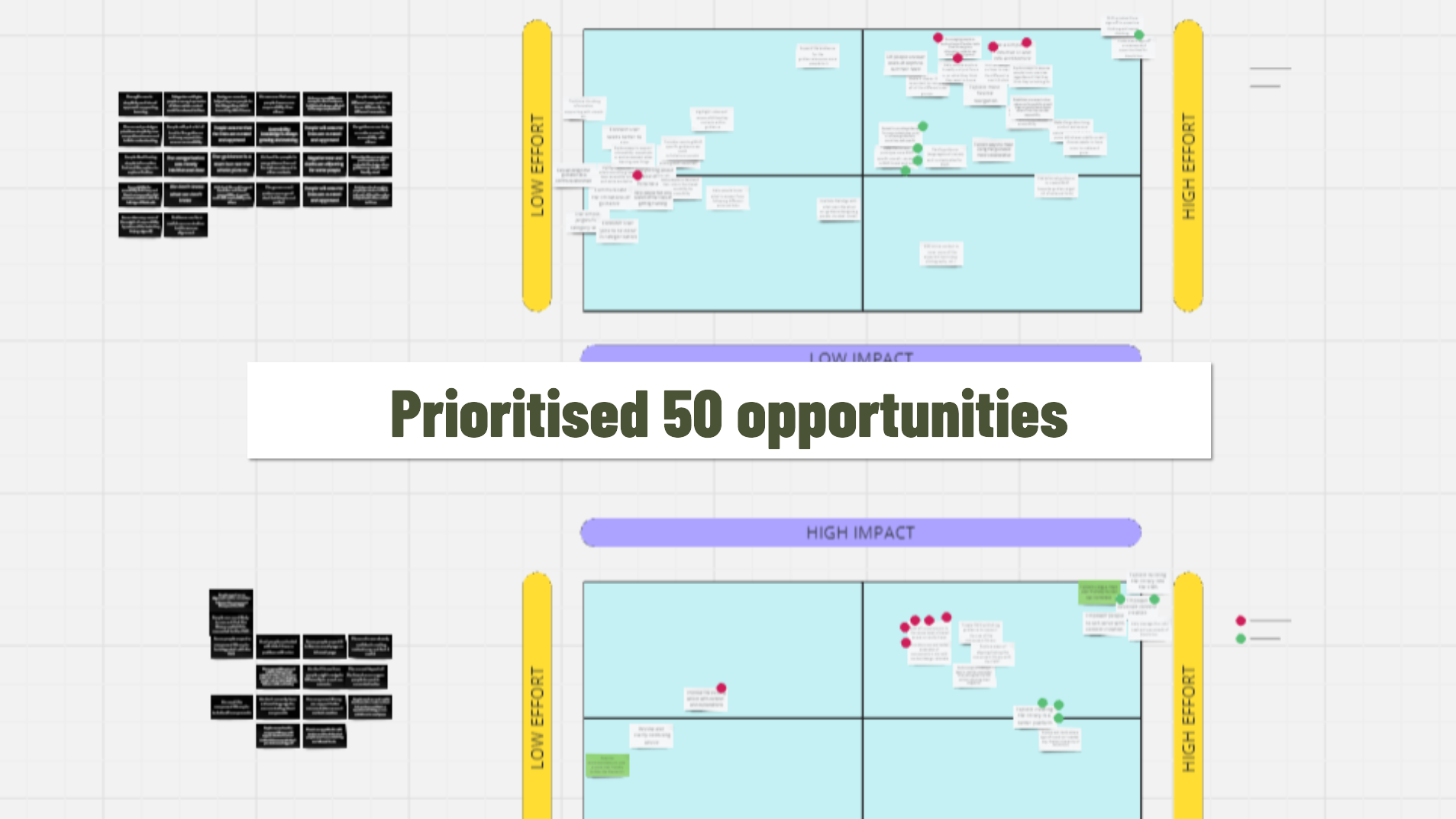
Prioritising and iterating improvements
Synthesising the testing data helped us identify 50 opportunities for possible next steps. To narrow in on a manageable set of improvements to deliver within scope, we prioritised the opportunities based on the effort involved in delivering them and the likely impact.
For the Accessibility Guide this meant redesigning the navigation to encourage broader exploration across different user needs and design activities. For the Component Library it meant adding components and supporting guidance on designing consistent and user-friendly page layouts. We also built feedback mechanisms into both prototypes so we could continue to learn and iterate.
Outcomes
The prototypes are currently live and collecting ongoing feedback as stakeholders across the organisation put them to the test in real work scenarios while we design and build a WordPress platform to house the next iteration of the Content and Design Framework.
Learnings
What went well?
Working in the open
Show and tells were regularly attended by 20 stakeholders across 6 directorates. Inviting stakeholders into the process meant we could address any concerns as they arose and incorporate feedback into decisions.
Evidence-based decision making
We collected over 2100 data points across user interviews and testing sessions and followed a robust collaborative synthesis process to reach insights that informed our design direction.
What was difficult?
Prioritising
The depth of our discovery work meant we were at times overwhelmed with data. It was hard to prioritise when many things felt important. We worked through this by referring back to what users told us were the most important problems to solve and using prioritisation frameworks like effort/impact matrices to guide us.
Embracing imperfection
As a team that values doing high-quality work, we sometimes struggled to be comfortable sharing work that was more rough and ready. To counter this we introduced a new team principle to ‘Get comfortable with good enough’ and used it as a reflection point in retros.
Next time I would…
Invite stakeholders to co-design
Collaboration with stakeholders through interviews and workshops at the discover and define phases helped to generate buy-in and provide direction to the work. However, involvement in the design phase was more limited to interaction during show and tells. Next time I would invite key stakeholders into design activities as sharing ownership of the outputs could help progress and enrich future phases of development.